Control charts
From Supply Chain Management Encyclopedia
Russian: Контрольные карты
Contents |
Overview
A control chart is a statistical method of monitoring a process on a regular and frequent basis and helping to determine whether a process is in-control or not.[1] It graphically depicts the average value (x-mean or range) and the upper and lower control limits (the highest and lowest values) of a process. The principal focus of a control chart is to separate special causes of variation and common causes of variation. Common (unassignable) causes are flaws inherent in the design of the process, but special (assignable) causes are variations from standards caused by employees or by unusual circumstances or events. Usually special causes have a negative impact on the output of the process and need to be removed.[2] These tools were first proposed by Walter Shewhart in 1924. Control charts represent one of the seven basic total quality management tools. There are two types of control charts: attribute and variable charts. Attribute control charts are used for categorical or alternative variables> For example, the p chart is based on the proportion of items in a sample that are in a category of interest. Variables control charts are used to monitor a process in case of numerically measured data. They are more sensitive in detecting out-of-control signals. The R chart, for example, uses the range of each subgroup, taken for measurement.
Statistical Background
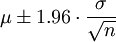
The idea is based on the principles of the sampling distribution: each process has variation, and we would expect 95% of all sample means to lie within 1.96 standard errors of the population mean:[3]
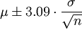
For use in control charts is necessary to calculate an interval, covering 99.8% sample means, that is:
The control charts approach expects periodical checking whether the production process is in-control, i.e. observed variations is within calculated limits. The process may shift as 1.5 standard deviations over the long term. Area under normal curve gives in that case 3.4 defects out of 1 million cases. General model for a control chart is:
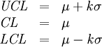
where
μ - the mean of the variable,
σ - the standard deviation of the variable,
k - number of sigma’s for interval limits calculations. If k = 3 we speak of 3-sigma control charts.
The interval between LCL and UCL may also include 1.5 sigma shift left or right of the bell curve target or median value. This approach is used in Six Sigma method of quality control [4]
Chart Details
The control chart consists of:
- Data points Each point represents the appropriate statistics (the range for the R chart, the proportion for the p chart etc.) for the set of measurements, taken in each data point. Data points should come in chronological order.
- Horizontal axis. It represents number of measurements made on regular basis (hourly, daily, monthly etc.)
- Vertical axis. It represents the scale of measurement (share or percentage for the attribute charts and possible values in real units for variable charts). This axis reflects the magnitude of the data collected.
- Upper control line (UCL). It is based on upper control limit, which is calculated using process variability criterion (the range or standard deviation). Points higher than UCL should be detected as special cause variation signals.
- Lower control line (LCL). It is based on lower control limit, which is calculated using process variability criterion (the range or standard deviation). Points lower than LCL should be detected as special cause variation signals.
- Central line. Represents mean characteristics of the process (mean X-mean, mean proportion, etc.).
- Warning limits (optional). WL could be added to the chart to show 95% interval for the statistics used (X-mean, range. These limits give signals that the process may be not correct.
- Action limits (optional). AL could be added to the chart to show 99.8% interval for the statistics used (X-mean, range). If some data points are outside of AL, possible variation should be detected and corrected.

Historical Facts
1924 — Walter Shewhart was the first to distinguish between common causes and special causes in process variation. Working for the Bell Labs he developed the basis for the control charts and the total concept of statistical quality control using carefully designed experiments.
1924 – 1925 — Control charts and his ideas came to the attention of Edward Deming, who taught statistical control methods, developed them and helped to implement quality control to Japanese business leaders. Control charts came into business practice.
1986 — Bill Smith using Motorola experience formulated special methodology for quality improvement, later called Six Sigma. Control charts became the part of DMAIC methodology.
Control Charts Types
p chart is used to evaluate process stability and to analyze the proportion of nonconforming items in repeated samples selected from a process. In this chart, we plot the percent of defectives (per working shift, per day, per machine, etc.). The control limits in this chart are based on the binomial distribution (of proportions). This type charts are most applicable to situations where the occurrence of defectives is not rare (where the percent of defectives could be more than 5% of the total number of units produced).
np chart there we plot the number of defectives (per batch, per day, per machine), but the control limits are based on the binomial distribution. This type charts are used if the occurrence of defectives is more than 5% of the units inspected.
R chart can be used for numerically measured variables of interest. This type chart uses the sample ranges which are plotted in order to control the variability of a process. R chart also require small sample size: 10 units or less.
X-mean chart also can be used for numerically measured variables of interest. In this chart, the sample means are plotted in order to control the mean value of a variable. It's possible to use X-mean chart together with R chart.
S chart there the sample standard deviations are plotted in order to control the variability of a process.
S**2 chart the sample variances are plotted in order to control the variability of a process.
C chart used to monitor and analyze the number of nonconformities in the area of opportunity. We should plot not percentage of nonconformities (as in the p chart), but the number of defectives (per working shift, per day, per machine, etc.). This chart assumes that defects of the quality have very small probability of occurrence, and the control limits in this chart are computed based on the Poisson distribution (distribution of rare events). C chart also require a constant number of units inspected.
U chart in this chart we plot the rate of defectives (e.g. the number of defectives divided by the number of units inspected), but does not require a constant number of units.
CUSUM chart cumulative sum control chart, is used to detect small changes between 0-0.5 sigma. Cusum charts plot the cumulative sum of the deviations between each data point (a sample average) and a reference value. Critical limits for a cusum chart are not fixed or parallel.
How to Use
- Step 1. Select the process to be charted and choose the type of control chart to use
- use the p-chart for data measured using two possible outcomes (for example, the billing can be correct or incorrect),use the R chart and the X-mean chart for data measured using a continuous scale (for example, weight of tea-bag on the line), etc.
- Step 2. Determine sampling method and plan
- choose the sample size and select a sampling method (use only probability samples). Then choose the frequency of sampling, depending on the process to be evaluated.
- Step 3. Collect the data using selected parameters
- gather the sampled data, record data on the appropriate control graph.
- Step 4. Calculate the appropriate statistics
- for example, mean value for the X-mean chart, then calculate the control limits depending on the type of graph.
- Step 5. Plot the data
- put on the chart the central line and limits, add data points. It’s possible to use special statistical software (SPSS, Stata, PHStat2 and others) for this purpose.
- Step 6.Analyze the chart
- use following signals to identify special cause variation points and common cause variation points
| Signal | Variation | Status of the process |
| The data fluctuates within the limits (between LCL and UCL) | Common cause | In-control |
| There are no major trends, the points vary, both above and below the average value | Common cause | In-control |
| 1 data point falling outside the control limits | Special cause | Out-of control |
| 6 or more points in a row steadily increasing or decreasing | Special cause | Out-of control |
| 8 or more points in a row on one side of the central line | Special cause | Out-of control |
| 14 or more points alternating up and down | Special cause | Out-of control |
- Step 7.Improve the process
- In case the process is not stable or is out-of-control, is recommended to use special quality improvement programs. Try to avoid these common mistakes:
- to change the process to accommodate the special cause. This usually adds cost and bureaucracy.
- blaming individuals. Not only does everyone make mistakes, but also chances are that the problem would have occurred regardless of individuals involved.
- exhorting workers to simply “do better”. People can only do as well as the system allows them to do.
References
- ↑ Duncan, A. J. Quality Control and Industrial Statistics. 5th ed. Homewood, Ill.: Irwin, 1986.
- ↑ Bhat K, Shridhara. Total Quality Management. Mumbai, IND: Global Media, 2010
- ↑ Wisniewski M. Quantitative Methods for Decision Makers. Pearson Education, 2006, 4th edition.
- ↑ Gordon Joseph M. Six Sigma Quality for Business and Manufacture. Elsevier, 2002.